We researched a large number of websites that influenced our ideas for our artist's website.
(INSERT INFLUENCES FILE)
Out of the ones we studied, here are of the few we enjoyed the most:
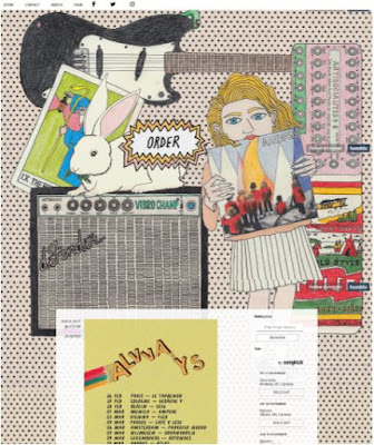
ALVVAYS - Click here to go the the website
Things we noticed:
- We liked the hand drawn/collage wallpaper in the background, which matched the aesthetic we were thinking of.
- It was especially interesting to see how their band name and an animated, flashing 'order' link were integrated into the design of their wallpaper. This is unconventional as many of the artist websites we viewed had the name of the band and links more pronounced using boxes/different fonts.
- The first main substance on the website is the tour information. We liked the idea of instantly informing the audience about upcoming events that they can engage with, and hopefully decide to spend money on.
- We noticed the band used a bar at the top of the website that allows users to navigate the different areas of the website (e.g. shop, videos). This is a convention we saw in most websites, and helps set up the website as a hub for the artist's audiences; for example, a fan of the artist's music can come to the website and then discover the artist's line of merchandise by finding the 'Shop' link.
- We noticed that they had links to social media in the bar as well (Facebook, Twitter, Instagram). Also a convention, we agreed that this was a good way to satisfy the audience's need to engage with the artist, and feel connected with the 'fanbase'.
BEST COAST - Click here to go the the website
Things we noticed:
- We like how the colour palate and photography is congruent with that used in the album cover. This means that the different elements of the promotional package work in synergy with each other. Therefore, fans of the album can visit the website and feel like they are continuing their 'experience' with the artist and feel more inclined to discover more about them.
- Like Alvvays, the first thing that is shown on the website is a promotion, this time for the album. We liked how the album cover itself is the link to the shop. Because our artist is releasing their debut album, we decided that we would promote the album before the tour on the website. This is because tours are often only attended by 'die-hard' fans of the artist, and our obscure up and coming artist will likely begin with a small fanbase of less reliable consumers, who would be more likely to give their hard earned money to an album and less likely to buy tickets for an expensive tour.
- We liked how the band title and navigation bar remained at the top of the screen, allowing the user more ease when navigating the website.
- We liked how the links on the navigation bar, instead of opening new pages, instead scrolled the user down to the relevant section of the website. We thought this 'one pager' web layout would be an interesting choice to consider using for our artist's website.


No comments:
Post a Comment