Here is the outside panel of my digipak album cover.
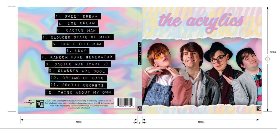
Here is the inside panel of my digipak album cover.

Here is a link to my artist's website. Please click on the image below to enter the website.

Showing posts with label AS Homework. Show all posts
Showing posts with label AS Homework. Show all posts
Friday, 9 September 2016

Thursday, 8 September 2016
Wednesday, 7 September 2016
HW 3b - Existing film continuity sequence analysis (BLK)
The Hunger Games Mockingjay: Part 1 (4:00-6:15)
Shot List
- Est. Victor's Village wide, still camera
- Est. Victor's Village, wide, very slow pan left (Katniss enters the square)
- MLS inside house (Katniss enters through the main door), camera pans right then crabs left as (Katniss walks down hall) ends on VLS
- MS (Katniss enters room), pans right to a MLS (Katniss goes to the table)
- MCU, side on (Katniss gets coat)
- CU of bottles (Katniss collects them), camera pans up to MCU (Katniss gasps, turns to right)
- MS (cat enters window)
- MCU reaction ("Figures"), camera pans right (Katniss goes to the cat)
- MS on cat's eye level (Katniss catches it), pan up to MCU cat's new eye level (Katniss holding it)
- CU Katniss ("do you want to see Prim?")
- MCU high angle (cat is put into her bag)
- MLS track behind Katniss (enters the living area), LS (Katniss walks to table) MASTER SHOT
- MS low angle side on (Katniss picks up photo)
- CU photo
- MS low angle side on (Katniss takes phot, notices flowers)
- Over the shoulder (flowers)
- MS low angle side on (Katniss picks the white rose)
- BCU rose (turned in hand)
- MCU low angle (Katniss reacts to rose), camera rises up to her eye level (she drops it)
- VLS living area (Katniss looks behind her back)
Continuity Techniques
- Two establishing shots (shots 1 & 2) to begin establish the setting where the sequence takes place; shot 1 introduces the house where the audience will shortly be taken (including the door where she will enter through), and shot 2 also introduces Katniss to the sequence who will be the focal character of the sequence.
- Most of the camera movement is handheld (e.g. shot 3). This makes the audience feel 'in the moment' as they follow Katniss, making her journey around the house flow as naturally as if the audience were walking with her.
- Transitions between shots appear seamless because the a lot of shots (e.g shot 3-4) begin where the actress ended up in the last shot (in shot 3, the camera shows Katniss from behind as she walks down the corridor - then in shot 4, the camera shows Katniss from the front as she walks from the corridor into the room). This makes shots flow naturally as Katniss moves from place to place.
- In contrast, some other shots intentionally take the audience to different places in the room without showing Katniss moving there (e.g. shots 5-6). This is creates an ellipse, which cuts out unnecessary shots of Katniss moving from set to set, but it still makes logical sense to the audience that Katniss is moving around the room (from the coat hanger to the bottles).
- Cuts do not break the 30 degree rule and change the perspective of the camera or the distance between the camera and the object enough between shots that there is no risk of creating a jump cut, therefore the sequence feels continuous (e.g. although shots 3 and 4 are both of the corridor, the camera changes perspective between them from behind to in front of Katniss, and also changes from a very long shot to a mid shot).
- The process of ellipsis is also helped by master shots (most notably in the transition between shot 11-12). In this transition, the scene cuts from a medium close up of the cat to a medium long shot of Katniss entering the living area. This second shot sets up the corridor leading to the living room, and the room itself, leaving the audience to understand that Katniss has left the previous room and is walking down another corridor to a new room. The master shot also introduces all the set pieces in the new room to give the audience a sense of space.
- Reaction shots are used, as it is logical for the audience to expect a shot of the character's face after a significant object is revealed (e.g. after the close up of President Snow's rose, there is a medium close up of Katniss' face to show the audience her shock at the rose).
Tuesday, 6 September 2016
HW 3a - Continuity task evaluation (BLK)
26/9/16 Continuity Task
1: The story of this sequence is simple; two school boys are walking towards each other down two paths towards, both of them pre-occupied; one of them is reading a paper (me), the other is on his phone (Emilio). Not seeing each other, they meet at the corner and bump into one another, causing the boy with the paper to drop his book.
2: To create narrative flow:
- We did not break the 180 degree rule; the camera never crossed the invisible line that joined the two characterises they walked towards each other. This meant that the perspective of the camera was always showing Emilio walking from left to right and me walking from right to left, so the audience is always aware of the characters' direction.
- Where there were two consecutive shots showing the same character, we made sure that the character landed on the opposite foot to the one they landed on in the previous shot to maintain a sense of continued movement.
- The actors began walking before the shot started to avoid the characters stopping and starting between shots, therefore maintaining the continuity of movement.
- We made sure we had match-on action, so that the content of each shot matched exactly with the last (e.g. the props that the characters' were holding were in the same hand for each shot).
- [similarly] We kept the character's moving for every shot, even if they were not present in the shot. This meant that the characters were where they would logically be in the narrative, and by process of ellipsis, the audience can identify that the characters were still walking between shots.
3: I think we achieved full continuity for the most part of this task. There was continued movement between shots, the perspective of the camera made it clear to the audience that the character's were walking towards a collision and I think that we achieved match-on action by keeping the props identically positioned in all the shots.
4: To improve the narrative flow:
- We could've avoided a lull in action at the beginning of shot 2 by beginning the shot with my character in the frame. This would improve the continuity of movement in this sequence and avoid the audience having to stare at an empty frame of a brick wall.
- We could've cut shot 4 a little sooner before we see the characters slowing in pace, so the speed of their movement would be continuous.
Monday, 5 September 2016
Hw 2c - Sound in film openings (DYM)
The Dark Knight (2008) Film Opening Analysis (0:00-2:20)
- Silence as studio title cards play through neon blue light; establishes comic book genre, whilst also hinting through the omission of upbeat 'heroic' soundtrack that the tone of the film will be darker than the average movie inn the comic book genre.
- Long, drawn out screech of a cello is heard over a zoom towards a glass building; establishes an eerie tone to the city, even though the visuals show us nothing out of the ordinary; non diegetic music builds tension and hints to the audience that something bad is about to happen.
- Ticking sound is added to the soundtrack which adds to the foreboding of the opening shot.
- Music is interrupted with the sound of a smashing glass as the zooming shot ends with one of the windows being blown out with a harpoon; the non diegetic music creates a voyeurism (the audience feels like a spectator outside the movie), then the diegetic sound effect instantaneously sucks the audience into being 'involved' with the movie.
- As the 'clown goon' sets up the harpoon, the methodical clicking of the machine and the sound of the harpoon firing are heard. The sound effects are not 'everyday' sounds, and this unfamiliarity couples well with the omission of familiar human faces, which are covered by clown masks; this pulls the audience into the world of these criminals and introduces us into seeing the opening from their perspective.
- The cello music returns as the film cuts to a long shot of a man standing on the curb of a street turned away from the camera as it zooms in on the clown mask he is holding. The sound of the cello is now established from the opening shot as being a non diegetic signal for something bad; the audience thus gets an uneasy feeling about this character. The grating, out of place texture of the cello screech also foregrounds the absurdity of the mask on the ordinary street to add to the audience's intrigue of the opening of the story (Who are these people? What are they going to do? Why do they wear the masks?)
- Again, the cello screech is interrupted by the screech of car tyres - the interruption of diegetic sounds over the non diegetic soundtrack could be described as an action code for this film (something the audience learns to expect)
- The soundtrack grows in texture with the addition of drums; this adds further tension onto the scene.
- Dialogue begins inside the car with the three clown goons, who discuss (over the top of the sounds of guns being loaded and the wheels of the car) the number of shares they are going to have; this sets up the story details and hints at the bank heist to follow and establishes a crime-drama genre. The sound effects on top provide more intrigue into the world of these criminals for the audience; these sounds are beginning to sound common place.
- "Don't forget the guy who planned the job." "He thinks he can sit it out and still take a slice. I know why they call him the Joker." - the dialogue is our first introduction to the film's antagonist. It establishes that at the beginning of the film, the Joker is not well respected by the people in the film. However, there is intertextuality in hearing the name 'Joker' as he is an infamous pop culture villain; by introducing the antagonist through dialogue rather than a visual introduction relies on the audience's pre-gathered knowledge of the character to incite tension - tension that is achieved whenever the character's mention the Joker.
- More dialogue from the goons on the roof to establish the Joker: "[he wears makeup] to scare people. You know, war paint." This provides story detail later down the line for the reveal of the Joker at the end of the scene.
- The soundtrack is low in volume, foregrounding the sounds of the door to the bank opening, the rushed footsteps of the goons on the floor - both of which are commonplace to the audience - before the loud bang of a gun being fired and the yells of the bankers breaks the familiarity of the soundscape; this does not necessarily cause shock to the audience, as the opening has been devoted solely to the criminal's perspective, but it does however cause the audience to re-evaluate whose side they're on. This is a major story point in the film, as the film challenges who the enemy really is.
- Over a soundscape of screaming, a goon shout "Alright everybody, hands up, heads down"; the command sounds very routine, establishing that Gotham city is often subjected to terror attacks of this nature and has grown akin to the interruptions of criminals (just like the audience has been)
Director: Christopher Nolan
Sunday, 4 September 2016
HW 2b - Analysis of titles in film openings (DYM)
 |
| Coraline 2009 |
 |
| The Parent Trap (1961) |
- Distributor
- Studios
- Title of Film
- Main Cast
- Lead Animators
- Concept Artist
- Art Directors
- Storyboard Supervisor
- Editors
- Visual Effects Supervisor
- Music
- Supervising Animator
- Director of Photography
- Producers
- 'Based on the novel'
- Written for the screen and Directed by...
THE PARENT TRAP TIMELINE:
- Distributor
- Studio
- Main Actor
- Film Title (+ based on the book)
- Stars
- Co-stars
- Featuring...
- Director of Photography
- Art director/Film editor/Set Decoration/Sequence Consultant/Special Photographic Effects/Costume Designers/Costumers/Make Up/Hair Stylist/Music Editor/Sound Supervisor/Sound
- Associate Producer/Associate Director/Dialogue Coach
- Music/Orchestration/Songs
- Special Titles/Sung by
- Written for the screen and Directed by...
Similarities:
- In both film openings, the opening titles began by crediting the distributor, followed by the studio - in both, these credits occur before the title of the film is established.
- In both film openings, the main cast are credited early on; around the time when the title of the film appears.
- In both film openings, the titles end by crediting the writer and director - coincidentally, in both films, the roles of writer and director are shared (the title 'Written for the Screen and Directed by...' appear).
- In both film openings, the titles are used alongside a puppet animation as an alternative focus (this is most likely because of the young demographic of these films, who might get bored if there is nothing to entertain them but credits).
- In both film openings, the credits for the main cast is followed by the credits for the artistic faction of the crew; in The Parent Trap, these include the set designers, costume designers and photography experts, and in Coraline, these were devoted to the lead animators and art directors.
Differences:
- The titles in The Parent Trap are (for the most part) in the centre of the frame and large; the titles in Coraline were to the side of the frame or in the corners.
- The titles in The Parent Trap were effected by the animation behind and moved around (e.g. moved on from the side by the curtains behind); the titles in Coraline faded on and stayed stationary, less distracting from the animation.
- In the opening of The Parent Trap, there were more titles, probably due to the old nature of the film, which put more emphasis on opening titles and made the crew and cast more overt for the audience than in current films; in the opening of Coraline, there were less titles, as more emphasis was put on the opening animation that sets up the iconography (dolls, buttons etc.) and story elements of the film.
- In The Parent Trap, the titles were separate from the puppet animation and the theme song; in Coraline, the titles appeared on top of the opening animation.
Friday, 2 September 2016
HW 1b - Reflecions on my film still (BLK)

19/9/16 Film Still Analysis
Q1: In what way can the film still be described as signifying your chosen genre?
- This film still depicts the silhouette of a man with his hands clasped to the sides of his head; this stance is typical of internal torment, signifying that the man is suffering from inner demons; this is a theme that is often explored in the psychological-horror genre.
- The still is mostly shrouded in darkness, with rays of light highlighting the silhouette and the curtains, yet dissipating near the edge of the frame; a contrast is therefore made between the light and the dark, further insinuating via the overwhelming abundance of darkness in the shot, that the darkness is overpowering the light; this connotes the struggle between good and evil, another common theme in the psychological-horror genre.
Q2: How did you direct the shot to achieve the desired effect?
- A light source was placed behind the head of the man in the shot in order to create a silhouette of the man's torso; this achieved a light outline of the man's head and arms to obscure his facial features, but still outline his pose.
- The shot was framed as a medium-long shot, which meant that the man was the focus of the shot, but was far away enough from the camera in order to create a tunnel effect (or a frame within a frame), created by the light reflecting off the curtains.
- Enough space was left to the left/right/above the man so as to contrast the small size of the man with the enormity of the space and darkness that surrounds him; this had the effect of making the man appear overwhelmed by inner demons.
- I wanted the audience to interpret the multitude of darkness (both surrounding the man and the darkness of the silhouette himself) to be symbolic of mental torment, or else any multitude of internalised feelings that are overwhelming and feel like they consume you (e.g. guilt, grief, self-doubt)
- I also wanted the audience to interpret the silhouette and the dark spaces around him to be significant to the character's mental state at that point in the film; it would seem, by the darkness and his frustrated stance, that perhaps the pressures caused by the film's disruption have finally began to take their toll on the character; maybe they are succumbing to insanity.
- I wanted the audience to interpret that the omission of the man's face connotes that the man is undergoing/ has undergone a change as a result of the mental conflict; he has lost what he used to be and is unrecognisable from the person he was earlier in the film.
- I think the silhouette, although not as pronounced as I would've preferred, successfully covered the facial expression of the man. This meant that the audience has little to interpret about this man from this part of the film, so his silhouetted pose is foregrounded to show his internal conflict.
- There is a nice balance of darkness and light in this film still which shows the audience a clear contrast that is commonly associated with good versus evil.
- I would've used a larger, brighter light source behind the man to create a better defined silhouette and put more emphasis on the man's pose, thus foregrounding his torment. Also, I would change the medium-long shot to a very long shot if a brighter light source were available, so as to maintain a similar light/dark balance in the original film still.
- I would've cleared the set but for the curtains (i.e. take away the step ladder/turn off the lights to the corridor) so the audience's attention is only on the silhouette. This would also make the contrast between light and dark more pronounced and therefore make the subtext of mental conflict more pronounced.
Thursday, 1 September 2016
HW 1a - Existing film still analysis (DYM)

Enemy (2013) End Film Still Analysis
Initial Analysis
NARRATIVE
- In the foreground, a suited man is turned away from the camera; this has the effect of hiding his expression/reaction to the spider in front of him.
- In the background, there is a massive spider against the opposite wall; it is not in a position that suggests it is about to attack, rather it's crouched body language and distance from the man in the doorway projects the opposite emotion of fear; this fearfulness juxtaposes with the spider's powerful body and implies that the man's character is a more terrifying monster than the spider.
- The spider's fearful body language is also juxtaposed with the calm nature of the man; the spider seems to symbolise something the man has done/said that is enough to scare this creature.
- The scale of the spider adds to the sense of hyper realism; the spider is not there in the real world. The contrast of the absurd against the real demonstrates the binary opposite between the normality of the suited man and the absurdity of the fantastical spider to contrast the two potential dangers (the spider appears unreal and is therefore less threatening, leaving the man looking like a more viable threat)
- There is a dull, yellow/beige colour palette as a backdrop, which compliments the bland nature of the man's life emphasised by his plain suited appearance; this contrasts drastically with the spider's inexplicable presence.
GENRE
- Man is standing in the doorway in a neutral position; this adds to the effect of shrouding his true emotions and connotes that perhaps he is not afraid of the spider/the spider is not a physical monster, but exists metaphorically; the use of signs to illustrate a mental battle in film is a theme explored in psychological thrillers.
- The spider is barely visible through shadow, the man's black blazer/dark hair also denotes darkness and the confined room is empty; all this suggests the themes of darkness, deceit secrets, that bad things often happen alone where no-one can see them; these are also signifiers of a psychological thriller.
AUDIENCE
- The small, confined room adds to the sense of claustrophobia and tension in the audience.
- The perspective is from just behind the man's shoulder, which means that the audience experiences the spider at the same time of the man, but likely reacts to it in different ways; this pulls the rug from under the audience, whose role as the voyeur watching a film from a fourth wall has been shuddered by the appearance of such an out of place creature, yet the man in the film itself reacts nonplussed.
Director Denis Villeneuve
Character in Shot Adam Bell (played by Jake Gyllenhaal)
Subscribe to:
Posts (Atom)