Here is our music video.

Here is the outside panel of my digipak album cover.

Here is the inside panel of my digipak album cover.

Here is the inside panel of my digipak album cover.

Here is a link to my artist's website. Please click on the image below to enter the website.

Tuesday, 31 October 2017

R+P Post 18: Analysis of my track's lyrics and instrumentation

One of the first things we did when we decided on our song was annotate a copy of the song's lyrics, highlighting what images and potential set ups they brought to mind.


The main refrains of the song are 'don't wake me up' and 'do you remember?'. These two phrases bring to mind images of intimate, shared experiences between two close people. We thought the song captured many independent moments where two people could easily share a 'iconic' memory ('the morning I was dancing in the rain'...'sitting under the old magic tree'). We also agreed that these memories seemed distant, and they were coming back to the artist in a dream like haze, hence the phrase 'don't wake me up'. 

We wanted to capture this by framing the narrative of our music video with our lead singer falling asleep, with most of the events in our story occurring in a dream landscape. This would illustrate the colourful way the artist remembers her fondest memories shared with close people in her life, which we decided would be her brother, her best friend, and her ex-boyfriend, all of whom are presented in the guise of famous characters across olden media. 

The keyboard is a signature instrument in this piece of music, and the synth effect on each of the chords give it a retro feel, taking the song out of the decade it was written and giving it an almost '70s aesthetic. This is why we chose to use similarly retro iconography by dressing our characters as iconic figures throughout history. 

Thursday, 26 October 2017

R+P Post 17: My Chosen Track

Our chosen track is the song 'Sweet Dream' by the indie band Black Cat Zoot.


Black Cat Zoot


Black Cat Zoot are a German indie/alt rock band who formed in Munich in 2005. They strive to innovate a unique sound of 'pop' music that revives the sound of classic rock with a modern edge. 


On their website, they had this to say about their approach to music making:


Sweet Dream is a song on their album 'Mutable Transformeract', which was released on the 29th April 2011. 


The album was produced by Hazelwood Music Production (f.1996), a German record label based in Frankfurt that produces obscure indie music. Although on their website they do not say that they focus on producing a specific genre of music, the most popular genre that they produce tends to be that of indie rock and pop. The album was recorded in Hazelwood's own recording studio.


We chose this song because we really enjoyed the innovative approach to the indie pop genre, with the quirky instrumentals and nostalgic lyrics mixing well with the catchy melodies that are associated with pop songs. 


We believe that this will appeal to our target audience of indie pop fans, for it is very obscure and thus appeals to their appreciation of discovering lesser known artists who produce pop music. 


We also believe this will appeal to our audience of young women and teenage girls because the lead vocalist, Lisa Milla, is a female and our survey to our target audience suggested that a substantial amount of young people appreciate it when the artist shares the same gender as them (26%). 


As for copyright information, as the song was released for free download on their website, there should be no problem in seeking permission to use the song. 


R+P Post 16: My band or artist

Our band is called The Acrylics, an British indie pop group. There are four members of the band, all university age - early twenties: Casey Tyler (vocals), Hugh Tyler (guitar), Terence Kitchener (keyboard) and Guy Chapman (drums).

Here are some existing indie pop bands that influenced the look we want for The Acrylics:

Band Influences
They have very liberal, accepting beliefs; most of their politics are centred around whatever allows people to live in the way they want, and so the band is publicly opposed to racism, sexism, homophobia and other similar current social issues. This trait was influenced by artists like Thom Yorke, lead singer of indie rock band Radiohead, who is an activist on behalf of human rights, environmentalism, anti-war and animal rights.

Thom Yorke
___________________________

Casey Tyler

Casey is a young woman who just graduated from university who was raised in a very liberal, middle class household. She has grown as a person considerably as a young adult, most predominantly in her understanding of her sexuality - not so long after forming the band, having dated only boys, she had her first relationship with a girl and has realised that she is a lesbian. Supported by her family and band members, she is now a strong advocate for LGBT+ rights and regularly supports petitions and movements that help this cause, such as All Out. In performance, Casey is playful, happy and likes to add her own quirks and sense of fun to her performance and choreography.

All Out - a charity that raise awareness of and helps end global LGBT+ issues that Casey is involved in
Here are some artists that influenced the look of Casey:


___________________________

Hugh Tyler

Hugh is Casey's older brother. The idea to have the two be siblings was inspired by indie pop bands like Sheppard and Echosmith, both of which involve groups of siblings.

Echosmith - made up of the Sierota siblings
Sheppard - formed by George, Amy and Emma Sheppard
Both Hugh and Casey were raised on their parents favourite films and music, leading to their enthusiasm for classic, nostalgic media. Whilst Casey focuses more on the lyrical side of Kaleidoscope's music, Hugh is primarily focussed on the instrumental side of the band. He is very supportive of his sister's sexuality, having been raised alongside her, and is very close to her. In performance, Hugh is a showman, likes to act very energetically and gets very excited playing his guitar.

Here are some artists that influenced the look of Hugh:


___________________________

Terence Kitchener:

Terence is the most recent addition to the band, having met the other three in university just before they were starting to form the band. Although he loves to have fun like the rest of the band, he is considered the most serious, as he likes to show off his keyboard playing skills and act smug when performing, and does not (like the others) tend to poke fun at himself.

Here are some artists that influenced the look of Terence:


___________________________

Guy Chapman

Guy is a family friend of the Tyler's and has known them for a long time. He shares a lot of the Tyler's interests, including older film and music. He is the quieter member of the band, and in performance plays the drums in the background with enthusiasm.

Here are some artists that influenced the look of Guy:


___________________________

THE ACRYLICS


R+P Post 15: My record label

Our record label is called TNT Records.


It is the sister company to Harvest Records, a UK based record label that produces predominantly indie rock music, and although ours will cater heavily to a similar audience of independent fans, TNT will focus on producing music of the indie pop genre.
TNT, like Harvest, will be a subsidiary to Universal Music Group, meaning that it will act as a 'spotlighting' company to seek out new talent in the pop genre with the hopeful intent of signing on a potential new star into Universal's repertoire of pop singers.


Wednesday, 25 October 2017

R+P Post 14: My target audience

Our chosen target audience is fans of the indie rock genre, with a skew towards girls aged twelve to twenty five.


To consolidate this decision, we went back to our target audience and provided a second survey from Survey Monkey to understand what they liked in artists, with the questions specifically tailored to indie pop genre.

When we asked them if they enjoyed indie pop, a fair number of our respondents did not actively listen to the indie pop genre. However, they did reference a lot of indie pop artists who they did enjoy listening to. 


When we asked them why they enjoyed these indie pop bands, the most common answers were that they liked the music because it was different and it set a mood.


This mood seems to be of an easy listening kind, meaning that the best song choice for our indie pop band would have to be one that is easily enjoyable and fun to consume. 


We then asked them what colours they associated with their favourite indie pop bands. They was an even split between the two most common answers, which were bright and pastel colours, and dark monochrome colours. Because we have decided to choose a more enjoyable and fun vibe for our track, we decided that the bright, pastel colours would be more fitting for our band. 


We then asked them what characterises they appreciate seeing in their favourite indie pop artists. The overwhelming majority was on political beliefs (65%), and as most of these respondents came from left wing, Labour families, we can assume that these are the beliefs they would like their favourite artist's to sympathise with. 


The next largest characteristics were regional identity and fashion, meaning we would keep our band as a British artist. We could incorporate some clothes inspired by hipster culture (e.g. hats, scarves, glasses) for the fashion sense of our band, as hipster culture is very prevalent with teens. 

Our survey has also revealed that a lot of young female music consumers appreciate it when a music artist shares their gender. We believe that as young women of this age group are still developing as people, it is important for them to have a role model in the music industry that shares morals that help young girls grow healthily. We believe our lead artist (Casey Tyler) is good role model for young women and will help share her tolerant, left wing values to young girls.

R+P Post 13: Influences and inspiration from art, fashion and culture

During our research, we found a great deal of inspiration from the movements in cultural styles and political movements.

We discovered a resurgence in bubble gum pop in the music scene. This was most prevalent in the 1960s and incorporated sing-along choruses, contrived childhood innocence, usually with an undercurrent of sexuality, to produce a sound of music that on the surface could be marketed to pre-teens, but was still catchy enough to be enjoyed by adults.

One example of bubble gum pop in it's period was The Archie's rendition of 'Sugar Sugar':

The Archies - 'Sugar Sugar' (1969)

This music style has made a reappearance in recent years, most predominantly by the debut song by Meghan Trainor 'All About That Bass'. This too has a catchy, sing-along tune, plus an aesthetic in the music video that definitely brings the bubble gum feel to life. Bubble gum pop is traditionally sing by unknown artists, and this song proved an instant success for the previously unknown singer, who's song has recently surpassed 2 billion views on YouTube.

Meghan Trainor - 'All About That Bass' (2014)

We were inspired to follow this upcoming trend by choosing a song and band image that we felt fit with this musical genre. We felt that because bubble gum pop proved a successful genre to explode onto the music scene with Meghan, it would be a genre that could also propel our own up and coming artist.

We were also inspired by the rise of hipster culture.


The hipster movement is one that has come into the public eye since around ten years ago, and denotes a lifestyle of living alternatively with a slight repulsion to anything that is conceived popular. This departure from the mainstream manifests itself in most aspects of lifestyle, including diet, fashion, art, sexuality and occupation. 


This alternative way of living is becoming increasingly trendy with young adults particularly. As alternative views and lifestyles are a convention in the writing of most indie songs, it would be fitting for our indie band to follow along with this cultural trend. 

R+P Post 12: Artists/bands that have influenced my ideas

Our group have discovered some bands and artists that have influenced the type of artist we would like to create:

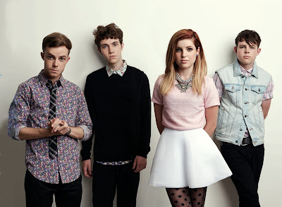
New Young Pony Club - English electronic music band

Things we liked about New Young Pony Club:
  • They create music that doesn't too closely resemble anything on the music scene, and yet can be enjoyed by the mass audience: "We marry the dance ethic with the pop ethic, and make something that you can dance to and sing along to".
  • Their fashion is colourful, playful and vibrant - they look out of this decade, and have a band image closer to something out of the '70s, suggesting an association to a 'golden age' in funky party music. 

We were heavily influenced by their image as a fun, partying band - we were inspired to use fashion sense as a means to display our own band's image. 

Echosmith - American indie pop band

Things we liked about Echosmith:

  • The members of the band are siblings, and this is conveyed through their social media presence, with a lot of their posts being dedicated to showing them as a family unit rather than as a band - placing the audience feeling like a 'friend of the family' rather than a distant fan.
We were influenced by their social media image, and inspired to have some members of the band to be related as siblings in order to push a more personal touch to their band image. 


Lucy Spraggan - English musician
Things we liked about Lucy Spraggan:

  • Her fashion is often shown as being smart, such as Echosmith style shirts, alongside an item of clothing that throws the smart feel off, e.g. a beanie, or bobble hat.
  • She is an out gay woman - her marriage to Georgina Gordon was very public - and she attracts a lot of young, LGBT fans.

We were influenced by Lucy's image as a role model for young, LGBT people, which is rare in the music industry, and as our target audience has already been decided to be teenagers, we were inspired to make our artist a member of the LGBT community to attract this demographic.

R+P Post 11: Artist websites that have inspired and influenced my ideas

We researched a large number of websites that influenced our ideas for our artist's website. 

(INSERT INFLUENCES FILE)

Out of the ones we studied, here are of the few we enjoyed the most:

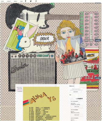
ALVVAYS - Click here to go the the website


Things we noticed:
  • We liked the hand drawn/collage wallpaper in the background, which matched the aesthetic we were thinking of. 
  • It was especially interesting to see how their band name and an animated, flashing 'order' link were integrated into the design of their wallpaper. This is unconventional as many of the artist websites we viewed had the name of the band and links more pronounced using boxes/different fonts. 
  • The first main substance on the website is the tour information. We liked the idea of instantly informing the audience about upcoming events that they can engage with, and hopefully decide to spend money on. 
  • We noticed the band used a bar at the top of the website that allows users to navigate the different areas of the website (e.g. shop, videos). This is a convention we saw in most websites, and helps set up the website as a hub for the artist's audiences; for example, a fan of the artist's music can come to the website and then discover the artist's line of merchandise by finding the 'Shop' link. 
  • We noticed that they had links to social media in the bar as well (Facebook, Twitter, Instagram). Also a convention, we agreed that this was a good way to satisfy the audience's need to engage with the artist, and feel connected with the 'fanbase'.


Things we noticed:
  • We like how the colour palate and photography is congruent with that used in the album cover. This means that the different elements of the promotional package work in synergy with each other. Therefore, fans of the album can visit the website and feel like they are continuing their 'experience' with the artist and feel more inclined to discover more about them. 
  • Like Alvvays, the first thing that is shown on the website is a promotion, this time for the album. We liked how the album cover itself is the link to the shop. Because our artist is releasing their debut album, we decided that we would promote the album before the tour on the website. This is because tours are often only attended by 'die-hard' fans of the artist, and our obscure up and coming artist will likely begin with a small fanbase of less reliable consumers, who would be more likely to give their hard earned money to an album and less likely to buy tickets for an expensive tour. 
  • We liked how the band title and navigation bar remained at the top of the screen, allowing the user more ease when navigating the website. 
  • We liked how the links on the navigation bar, instead of opening new pages, instead scrolled the user down to the relevant section of the website. We thought this 'one pager' web layout would be an interesting choice to consider using for our artist's website. 

R+P Post 10: Album covers that have inspired and influenced my ideas

During our research, our group looked at a variety of album covers to find ones that influenced our ideas for our own album cover.


Here are some of our most influential:

FRONT
BACK
The cover for the debut studio album Lungs by the British indie rock band Florence and the Machine denotes the lead artist in front of a curtained backdrop and colourful flowers. The front of the album cover keeps with the conventions by displaying the lead artist, and by having the name of the band and the album. For a debut album, we believed this was important as there is not yet an audience to associate the name with the music, so showing the artist on the album is important to begin establishing a connection for the audience between their image and their music. We agreed that for our upcoming artist, we would follow these conventions for similar reasons.

We also liked the use of a uni-coloured green backdrop and pale coloured flowers to establish a colour palate with this artist; we thought this simplistic design successfully conveyed the heartwarming mood of the album, and we discussed ways in which we would use our pastel colour palate in our album cover to convey our band identity.

The back of the cover contains conventions of album covers such as a track list, a barcode, copyright information and logos for record labels. We thought this was important to add to the back of our own album.

FRONT
BACK
The album cover for London Calling by English punk band The Clash has a grayscale photograph of the guitarist swinging his guitar to the ground in a performance to smash it. This is an iconic image and perfectly conveys the rebellious message of the band and their music. Although our group are not thinking of a rebellious, 'angry' tone for our own band, we really liked the simplicity of having a photo of someone performing be the album cover and what their look when seen live says about their image. We also liked the live performance aesthetic because it is a convention for independent artists to portray themselves performing live on their album covers, as it demonstrates that they are all about 'the music'. This is a convention we would like to portray for our band, and this cover influenced us to consider whether using an image of our artist performing would be a successful way to convey this.