Here is our music video.

Here is the outside panel of my digipak album cover.

Here is the inside panel of my digipak album cover.

Here is the inside panel of my digipak album cover.

Here is a link to my artist's website. Please click on the image below to enter the website.

Saturday 23 December 2017

Construction Post 6: Website Post-Production

The second ancillary product we constructed for our artist's promotional package was the website. I headed the construction of this product, but still received lots of support and effort from Emilio and Noa. Most of my time was spent on the website, and it was here that I believe I learned the most skills.


What we needed:
  • A blog style website
  • Lots of opportunities for interaction
  • Lots of opportunities to purchase (both merchandise and the album)
  • Lots of opportunities to inform the user about the band
  • A colourful, quirky aesthetic that synergises with the branding of our other products
What we used and how we used it:

I created the website on Wix.com. Wix.com was a surprisingly easy piece of software that allowed me to create the website the way I wanted. It had a variety of different layouts for me to choose from when I first logged on. This was helpful as I could find a template for a blog styled website and adjust it from there to create our band's website, which saved time having to create the tools to make the blog aspect of the website aesthetic work.


There were lots of tools that allowed for interaction, information and purchase, including:
  •  Slideshows and gallery - the user can cycle through images and links that discover more about the artist and allow more interactive ways of finding new parts of the site other than scrolling down.
  • Hover boxes - the user can hover over boxes and it will reveal something new. I used this for the info boxes on each of the members of the band so the audience could fulfil their curiosity and discover more information about the band.
  • Light boxes - the user will be introduced to the website with a page before they can enter the website, which will promote the album and provide a link for where the user can purchase it, and listen to it on Spotify and iTunes. The user can close this to continue to the website, where their are plenty of other opportunities to purchase the album inside. 

The pre-prepared tools were easily adjustable to suit our needs; for instance, images could be quickly adjusted in contrast, brightness etc. and pastel colours and rounded borders could be used to make our website suit our fun, colourful band aesthetic.


I learned a lot about web design in the process of this construction task. Before the construction task, I had only used Wix.com once in preparation for this activity, and although I got an idea of how the software looked and how to use the menu to find my tools, I have gained hands on skills using web design software and I now feel much more confident in using Wix.com to create intended effects. I have also learned a lot about laying out websites clearly and the importance of allowing lots of facilities for the user to find their way around the website; for example, I found I was using the 'Button' icon a lot to link the user from various sub pages back to the main page, and I was linking various images to do with the album to the shop to allow the user opportunities and free reign on when they wanted to purchase.


Wix.com ticked all the boxes for our needs. The only problems I faced using the software was that it was liable to lagging and crashing. This was frustrating and time wasting in our limited time constraints, but did not prevent the overall progress of the construction drastically. 

Other software I used were:

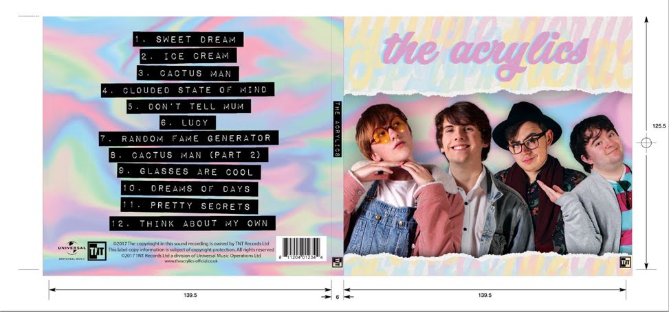
Adobe Photoshop - each promotional photograph featured on the website needed some work on this software before it could be put onto the website, including shot healing, colour adjustment and so forth. I could also create banners and posters to be featured on the website, including the 'we are The Acrylics' banner on the homepage slideshow, and the tour poster. I also needed Photoshop to create the merchandise, which would need to feature our logo and/or some lyrics and colours associated with our brand. 

Audacity - I briefly used audacity to create sound files for the music page of our website.

My contribution

During the construction of the website, I :

  • Headed the website task and made some executive decisions on the website, which I then verified with the rest of my group
  • Used web tools to create interactive effects on the website
  • Created some promotional material using Photoshop, including the tour poster and the 'we are The Acrylics' banner
  • Created merchandise that can be sold using Photoshop
  • Set up Ticketmaster and Bandsintown accounts for the user to access when finding out about tour information

Challenges we faced and how we overcame them:

Besides lagging from the website, most of the problems we had with the website we worked around through problem solving and by gaining more knowledge on how Wix.com worked.

For instance, we wanted to link pictures of the band members to their personal galleries, where the user could cycle through the pictures at will. However, there was no tool to link a picture to a gallery. We could, however, link the picture to a light box, so what we did was create a gallery, then put the gallery onto the light box and link the image to the light box. This way, the user could be taken to the galleries of each band member without being taken into a new page, which made it easier to go back to the original page once they had looked through the gallery.

Here is our finished website:


Construction Post 5: Digipak Post-Production

As well as the music video, we needed to create two ancillary products for our artist's promotional package, and the first of those products was the digipak album cover.  Noa headed the construction of the album cover, because this played to her strengths in editing on the software we used and her knowledge of shortcuts to create intended effects that would create the best quality product in a short time. Emilio and I also fed in our own skills and ideas to contribute to the task.


What we needed:
  • An innovative design that stands out, particularly on the front cover, that makes our audience interested and willing to buy it
  • Photos of our band to identify the artist with the music
  • Include a bar code, record label and copyright information
  • A colourful, quirky and handmade aesthetic that synergises with the branding of our other products
What we used and how we used it:

We created the album cover on Adobe Photoshop. Photoshop was a perfect piece of software to use as it includes many tools and options that would allow us to make our album cover the way we wanted it. Furthermore, all of us had a good understanding on how Photoshop worked; Noa in particular is very confident in using the software and finding her way around it to create our intended effects.


The first thing we needed was to place the photos of the band members on the front cover of the album. To do this, we selected the pictures we wanted from our studio promo shots, then coloured the backdrop a different colour (we used blue) to obscure the white areas. We then used the quick selection tool to select the coloured area of the backdrop and delete it. By colouring blue, the area was easier to select and also caught more areas of the backdrop than if we'd used the quick section tool on the original image. One thing I learned was that by selecting the outline of the band member and right clicking on the image, you could change the quality of the outline by sliding options such as 'Contrast' and 'Feather' to make the outline less harsh. We also selected to create a New Layer with Mask. This meant we could erase any remaining areas of backdrop from the images without erasing parts of the original image.


Another thing we needed was to create a colourful backdrop. We decided that as our band name is The Acrylics, we would create a paint like backdrop for our outside panels. To do this, we created a page of colours (blue, pink, green, yellow) and swirled them using the blend tool. This created the effect of paints mixing and, when adjusted in brightness and colour balance, the result is a very pretty background that is light enough to not make the front panel too busy.


Photoshop also allowed us to place bar code, record label and copyright information onto our back panel.


Photoshop ticked all the boxes for our needs. It lent us lots of effects and allowed us to accomplish all of our original designs, as well as helped facilitate the designs we wanted later. It was easy to use, and despite some problems we encountered when using the software on one of our computers, we were very happy with the software. 

My contribution

During the construction of the website, I :
  • Contributed my ideas for the layout of the album cover, including how the band members should be arranged on the front
Construction of the Digipak's second draft

  • Helped Noa on Photoshop with the creation of the background

Challenges we faced and how we overcame them:

Our original plan for the front cover was to have the band members decreasing in size, with their feet at the bottom of the panel and their bodies standing in a line gradually getting smaller and smaller from left to right. When we attempted this, we realised that the faces of the band members were hard to see clearly and their bodies looked a little odd. After getting feedback from our target audience, we found out that they too would change the way the band members were arranged, Therefore, we changed the framing to a mid shot and placed the band members slightly behind each other in a line. This way, the faces were easier to see, making them more identifiable to an audience, and the overall look of the front cover improved.

Construction of the Digipak's first draft
Another problem we faced was that Photoshop suddenly became very difficult to work with mid way through the construction process. The software was difficult to use, certain tools and key commands were unresponsive and the layout could not be rotated to access the other side of the digipak. We managed to overcome this by switching computers.

Here is our finished digipak album cover:


Construction Post 4: Music Video Post-Production

Our main product was the music video. Emilio headed the construction of the music video, because this played to his strengths in editing our footage on the software we used and his knowledge of how to create great effects we wanted, such as tri-chroming. Noa and I also fed in our own skills and ideas to contribute to the task.

What we needed:
  • A  vibrant music video that matched the energy of the track
  • Lots of shots to demonstrate performance - e.g. shots of Casey singing to camera, band members playing instruments etc.
  • A clear narrative throughout the video
  • A colourful, quirky and handmade aesthetic that synergises with the branding of our other products
What we used and how we used it:

We created the music video on Adobe Premiere Pro.


This software was perfect for creating our music video as all of our group were very confident using the software, having utilised it in video edits before in Media Studies. We are all very confident in how to achieve intended effects; Emilio in particular is very confident in using the platform, and knows how to access all the tools he will need on the software.

One of our first tasks was to make sure Noa's lip synch matched with the vocals on the track. To do this, we dragged the full take from the file on the left of the screen, cut the beginning and end so that we were left with just the performance, and brough the clip down to the timeline. We then used the audio track of the clip to help us match it with the audio of the track. This helped us make sure that the lip synching looked convincing in performance. We did a similar thing to help us with matching strokes on the guitar and drum beats.


We also needed to make sure the narrative was clear. In our music video, we have both performance and narrative, with the narrative sections being split amongst multiple 'dream worlds' which Casey finds herself in. To make sure the performance and narrative did not get confused, we graded the shots slightly differently. Performance shots were brighter and the pastel pink colours were only saturated a little to make the colour pop for the audience to see. Narrative shots were graded more heavily with more heavily with saturation and colour balance to make them stand out amidst the performance shots as noticeably more colourful.


We also differentiated the different narrative 'dream worlds' during editing. We added a flash effect before Casey enters each dream to signify a new dream beginning and the last one ending. We created the flash by making a plain white colour that we increasedand decreased in opacity very swiftly to mask the cut between the two shots. We added the same effect for when she wakes up and when the party sequence begins to signify what is and isn't a dream.


My contribution

During the construction of the music video, I :
  • Contributed my ideas for edits and changes to shots
  • Helped Emilio edit and grade the music video

Challenges we faced and how we overcame them:

One challenge we faced was that our first cut of the music video was too slow for the track: it included much longer shots and fewer cuts. When we showed this to our target audience, they suggested that the video needed to have a quicker pace to match the energy of the track and the performances. We overcame this by adding in more quick cuts, similar to Echosmith's Cool Kids, which included takes a few milliseconds long of instruments and dances to quicken the pace of the video and keep the audience on their toes. We cut down shots of the band members playing instruments and spliced them in to the longer shots. When we showed the new version to our target audience, they found that the improvements worked very well.

Here is our finished music video:

Sunday 10 December 2017

Construction Post 3: Week 3 Production

In our third week of production, we completed the rest of the photoshoot for our professional promotional shots. 

Overview of the Week:

I think that week 3 of production was very successful.


We wanted to promote our band as fun loving, out-going, adventurous and London based musicians.We managed to shoot a range of promotional photographs in a few different locations. This gave us a lot of choice for photographs of our artist to put on our website, along us to successfully promote our band members in the way we wanted.

We used Emilio's camera for our shoots. We chose locations in London in which to shoot, and these locations were:

  • Haselbury Road Park (Edmonton Green)


  • Church Street Bus Stop (Edmonton Green)

  • Whitechapel 

Our group chose to shoot on Haselbury Road as it is on the road of our school, so it would cut down on time and money to travel, which was important due to our time limitations. Tom was not available to shoot for this day, so we decided to focus on shooting photographs of Casey and Hugh and foregrounding their playful relationship as brother and sister. We did this by shooting lots of photos of them climbing trees and going on playground equipment.


We then shot in Whitechapel, this time with the whole band, and got some nighttime shots of London with the band. This portrays a different side of the band, as it shows them as a tight friendship group as well as a professional band.


With these promotional shots, we chose a variety of different angles and framing to get a good range of photos to choose from. For instance, in the Casey and Hugh shots, we shot the pair next to each other in mid shots to make them appear close as siblings. These looked more professional, but provided plenty of meaning into their relationship as siblings.


We shot some band shots as 'selfies', with Casey taking a photo of all of us on a phone; this reinforces their image as a tight friendship group, and also taps into the culture of our target audience, who publish their selfies on social media as means of advertising their activities. These shots looked less professional, but were more relatable and appealing to our audience.


Although the technical kit was not unlike the kit I've used before, I did have another good chance to work with a camera to create photos, except this time in outdoor locations. I learned a lot about using backdrops such as trees, branches, equipment, brick walls and other pieces of our surroundings to my advantage in order to create an interesting shot.


My group all had opportunities to use the camera and we all fed in new ideas for shots when we reached the location. I believe that we all came out of this week having had a good experience.

Overall, I am very happy with how the photos that Noa, Emilio and I took came out, and I am confident that they will be very useful when publishing them on our website to promote our artist.

My contribution:

During the third week of production, I:
  • Shot a lot of the promo shots, including the photos of Casey and Guy.

  • Performed in front of camera as Hugh Tyler. 

  • Offered ideas for potential shots that involved aspects of our environment. 
  • Helped organise locations.
Challenges we faced and how we overcame them:

For the shoot in Edmonton Green, we did not have Tom available to perform as Terence in front of the camera. This was a shame as we could not have any full band shots with these locations. However, we decided that we would instead focus on shooting shots of Casey and Hugh, as we had previously not had an opportunity to have many photos which show their relationship as brother and sister. After the shoot, we realised that this was a better use of our time, as we already had many whole band shots from the second week of production, and this proved to be a minor set back.

We also had to take photos in the evening for the Whitechapel shoot. This was a challenge as it is hard to create a professional quality photo with such low ambient light. We shot in the brightest areas we could find, such as in walkways which had lamps in them. We also decided to create shots that were purposefully less professional looking so that they appeared more genuine and like photos that a group of friends would take of themselves. We found that this approach demonstrated a new side of the band and in the end, we were happy with the quality and overall look of our photos from that evening.


Construction Post 2: Week 2 Production

In our second week of production, we completed the studio photoshoot for our professional promotional shots and album cover photos. 

Overview of the week:


I think that week 2 of production was very successful.


We managed to shoot a lot of professional, high quality photos that we will use for our promotional material and for our album cover. We made use of our school's white screen and lighting kit to create bright photos of each individual band member and of the band as a whole. This included a variety of shots from different angles and framing, and with the performers using multiple poses, facial expressions and props.


Casey in different framing
I learned a lot about the kit used during photoshoots, including the lighting used to create the flash and the various hardware that synchs the flash with the camera. I had a chance to work with more kit I have not yet had experience working with and I had a lot of fun photographing other members of the band.

My group worked efficiently and professionally, and shared out the roles equally so that we all had a turn using the camera. In this way, we all walked away with the same valuable experience.

Overall, I am very happy with how the photos that Noa, Emilio and I took came out, and I am confident that we can create a high quality album cover and a lot of professional promo shots when we get to post production.

My contribution:

During the second week of production, I:
  • Shot a lot of the promo shots, including most of the photos of Casey.
  • Performed in front of camera as Hugh Tyler. 
  • Adjusted the intensity of the lights to create a better image. 
  • Helped organise the schedule for when we would be filming each person.
Challenges we faced and how we overcame them: 

We had a short two day time limitation for our photoshoot, as this was the only opportunity for us to use the photoshoot kit before it was dismantled. This was especially a problem as we could only have the whole band available for one forty minute period, and the same amount of time to do Tom Brown's individual shots.

Tom's promo shot

In order to make efficient use of our time, we scheduled what we would shoot in each school period so that we could immediately arrive at the start of the session knowing what to prepare and what costume to change into if necessary. We agreed to schedule the photoshoot so we could get all the necessary shots of each band member done in the space of forty minutes. Although a little longer was needed for Casey as, being the most prolific member of the band, she needed a larger amount of shots, we managed to finish all of our promo and album cover shots before our deadline.

One challenge we faced during the photo shoot was the shots for the individual band members. It was difficult to create candid looking shots without making them look forced. We overcame this by allowing conversation between the photographer and the performer whilst the shoot took place to create a relaxed atmosphere, so that when the performer laughed or smiled, it was genuine. This resulted in photographs where the subjects look like they are enjoying themselves, which is an important when attracting an audience to a brand, as audiences find attractiveness in artists who appear like they are enjoying their work.


On the flip side, as a subject of the photoshoot, I personally found it difficult initially not to 'freeze up' in front of the camera and smile forcibly. I helped myself get over this by thinking of happy or funny memories to make me smile in a genuine way that didn't look forced.


Construction Post 1: Week 1 Production

In our first week of production, we completed the filming for our music video. 

Overview of the week:

I think that week 1 of production was very successful.

Our whole cast
We managed to get all of our shots filmed, including multiple takes and multiple versions of shots - different angles, camera movements etc. - to allow us a lot of choice when we got back to the editing suite. I am very happy with how our footage turned out; I believe our performances were all highly energetic, and our shots all look very colourful and befitting to the image of our band which we are trying to promote.

Although filming intensively for a week was exhausting, we still had a lot of fun working together to finally film our creative ideas that we have been planning for weeks.

We also learnt a great deal about the logistics of working on a film shoots. As well as gaining lots of experience working with the technical kit, such as the camera and the studio lighting, we also learnt a lot about co-operation, problem solving, how to make efficient use of our time, and how to keep the energy and morale up for a whole week.

Each of us took equal responsibility in the different areas of the shoot, including filming, lighting and performing, and shared these roles equally.

Overall, although at the end of the week I was very tired, I felt that it had been a very rewarding and enjoyable experience, and I was proud of Noa, Emilio and I for managing to complete the filming of our music video.

My contribution:

During the first week of production, I:

  • Filmed a good proportion of the music video, including the Alice in Wonderland and Sergeant Pepper set ups. 
  • Did the lighting for a lot of our set ups before filming.
  • Performed in the music video as the band's guitarist, Hugh Tyler.
  • Directed the other performers to try out new actions; e.g. gestures and facial expressions for Casey to do whilst singing, create 'signature moves' for the extras that related to their characters.
Shaggy's (played by Ray Baker) signature move
  • Helped choreograph some extra dances moves for the Singing' in the Rain set up.

  • Briefed our extras, letting them know what to do and all the health and safety information
  • Backed up a lot of our footage onto our Mac and hard drives, and formatted the camera afterwards to wipe the SD card for a new shoot. 
  • Helped keep up morale by providing food and drink to shoots. 

Challenges we faced and how we overcame them:

Our first challenge was to organise our ensemble of extras in the first day of our shoot, which took place on the Saturday. With this number of extras to deal with, we had to make sure they all knew what they were doing, how to behave and any health and safety notices so that no-one would end up injured. We kept control over our cast by giving them all a quick briefing in the morning. This meant that they all knew the rules of the studio, health and safety hazards they needed to be aware of and what they would be required to do in their performance, so that when we began shooting, we could be confident that everyone would be able to behave professionally and be confident in what they should and shouldn't be doing. We also had snacks, music and frequent breaks to keep their morale and energy high. On reflection, we had no major problems from our cast; they all danced energetically and behaved very well whilst in the studio.


Secondly, we had a problem creating the infinity effect on our cyclorama, as there was an obvious crease where the curtain on the back wall met the floor, resulting in a dark line behind the performers. We attempted covering the crease with sheets of white A3 paper, a method that worked during our Echosmith remake for our prelim. However, we realised that this effect only worked when the lighting was over exposed and white so as to blend the gap between floor and wall, whereas in our more colourful, less exposed lighting set-ups, the paper was very obvious and the gaffer tape used to stick the paper down shone in the lights, resulting in a tacky unpleasant result. We decided that the best option for our music video was to take away the paper and leave the crease. We decided this because it did not matter to our music video aesthetic if it was obvious that our video was shot in a studio, as our handmade props and set design already display a very stripped back, raw image.

Our cyclorama
Another problem this challenge created was that laying down the paper to see if it looked good took up a large amount of our scheduled shooting time for the Sergeant Pepper set up. This was luckily easily resolved because we had scheduled a longer period of time later on in the week in which to catch up on shooting this set up, and luckily this did not delay our shoot.

Our main challenge we had to face happened mid way through the week, where a substantial amount of our footage got corrupted whilst we were backing it up onto our hard drive. This meant that we had to schedule reshoots for three major set ups, that being Singin' in the Rain, Alice in Wonderland and our handheld band shots. Fortunately, we had prepared for a technical issue like this to occur and had planned to finish our shoot on Thursday, leaving Friday through Saturday clear if we needed any back-ups. Therefore, we scheduled reshoots for our missing footage on the Friday and Saturday, deciding to shoot our two themed set ups on Friday and our band shots on Saturday, when Tom was completely free. The reshoots went very well, and we decided to make the most of them by improving on the ones we shot before. For instance, we choreographed a lot more interesting dance moves for our Singing' in the Rain sequence, taking more inspiration from Gene Kelly's dancing in the original movie.

We were not 100% how the corruption occurred, so to make sure it didn't happen again, we agreed to back up our footage onto two hard drives from then on so as to have two back ups if one transferral did not go well. We were also more careful not to touch the hard drive when it was backing up so we didn't disturb the process, and made sure to review every piece of backed up footage before we formatted our SD card.